

As it's clearly visible in the comparison below, the old design was really a pain for the eyes and what we especially hated was that overwhelming baby blue background. Which by the way became a very important characteristic of the brand over the years so in order to not confusing the existing users, this color was one of the original things we had to find a way to keep.
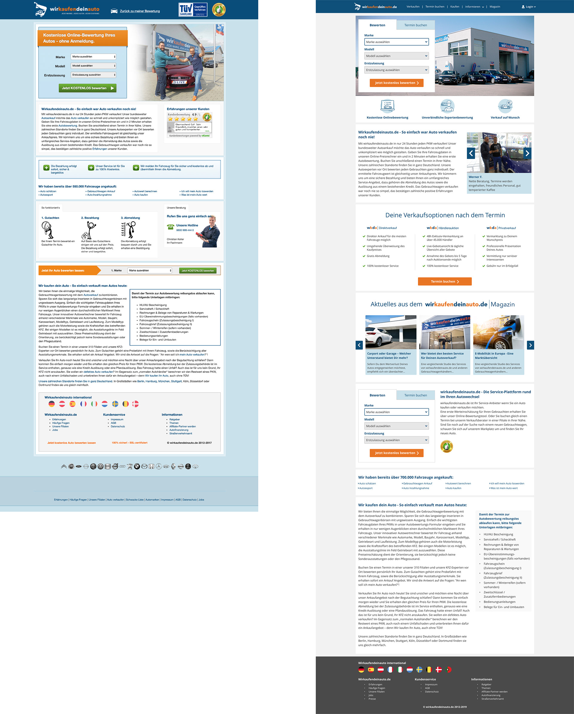
We also had to respect very strict limitations coming from Conversion Rate Optimisation and Search Engine Optimisation but at the end of the day we were able to give it a lot cleaner, a lot more modern look which didn't scare off the users.
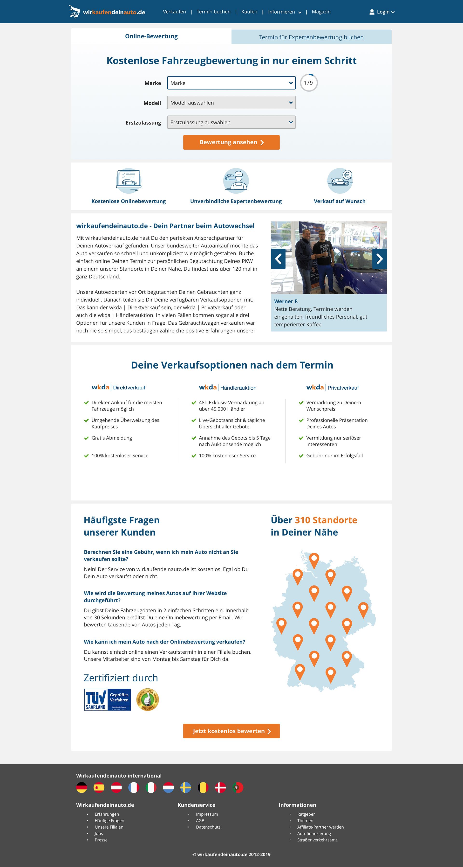
One of the variations of the car evaluation funnels.